Entrée: Responsive Recipe Webapp

Overview:
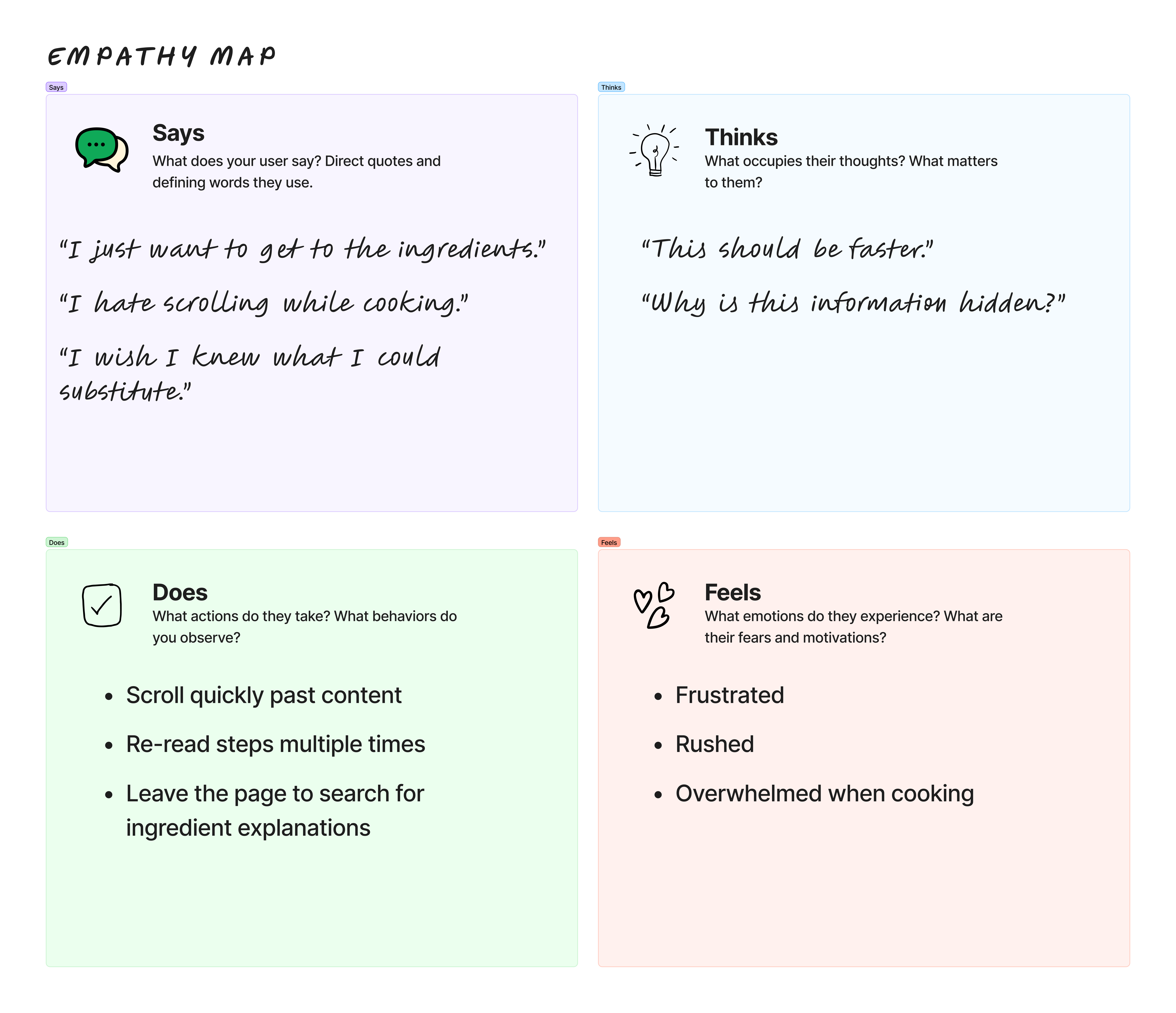
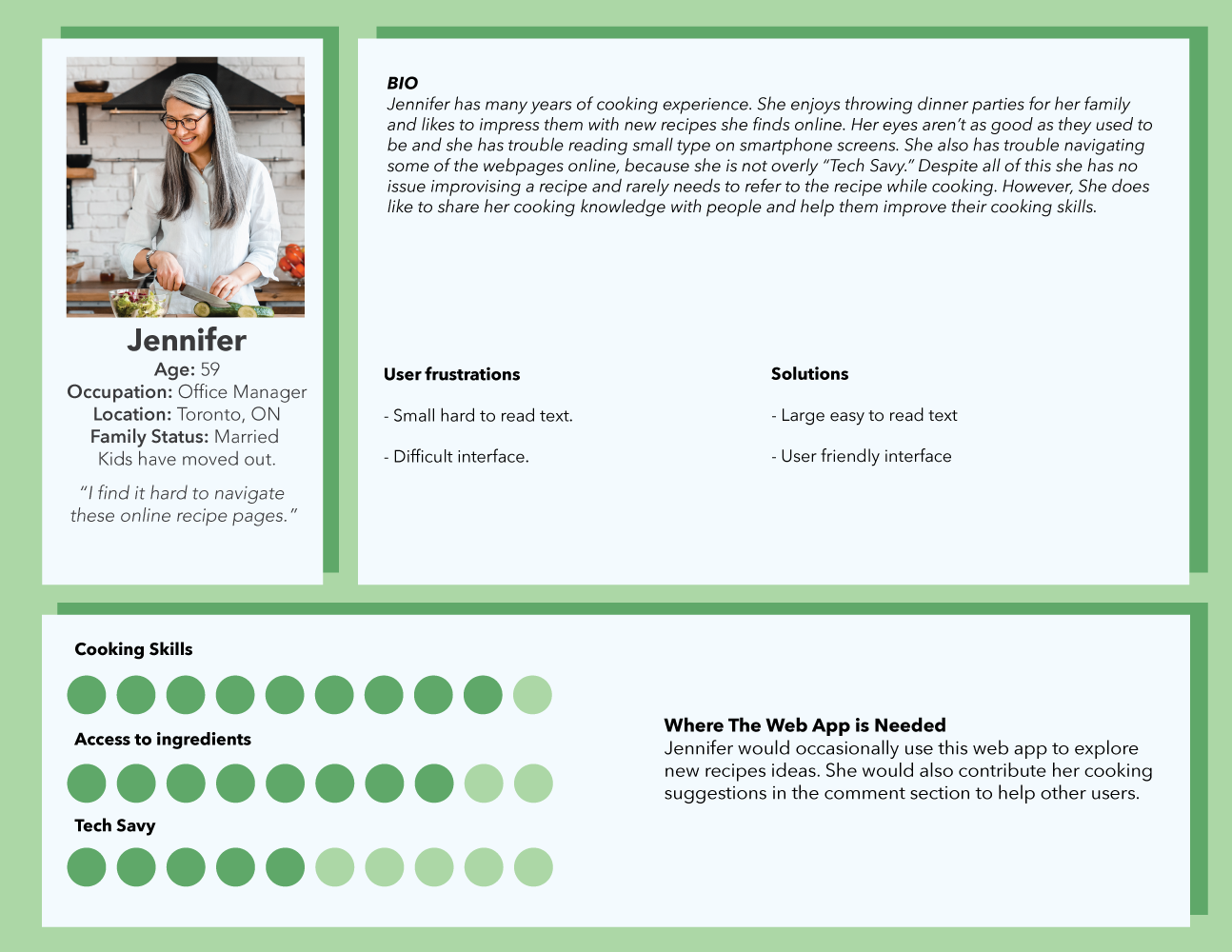
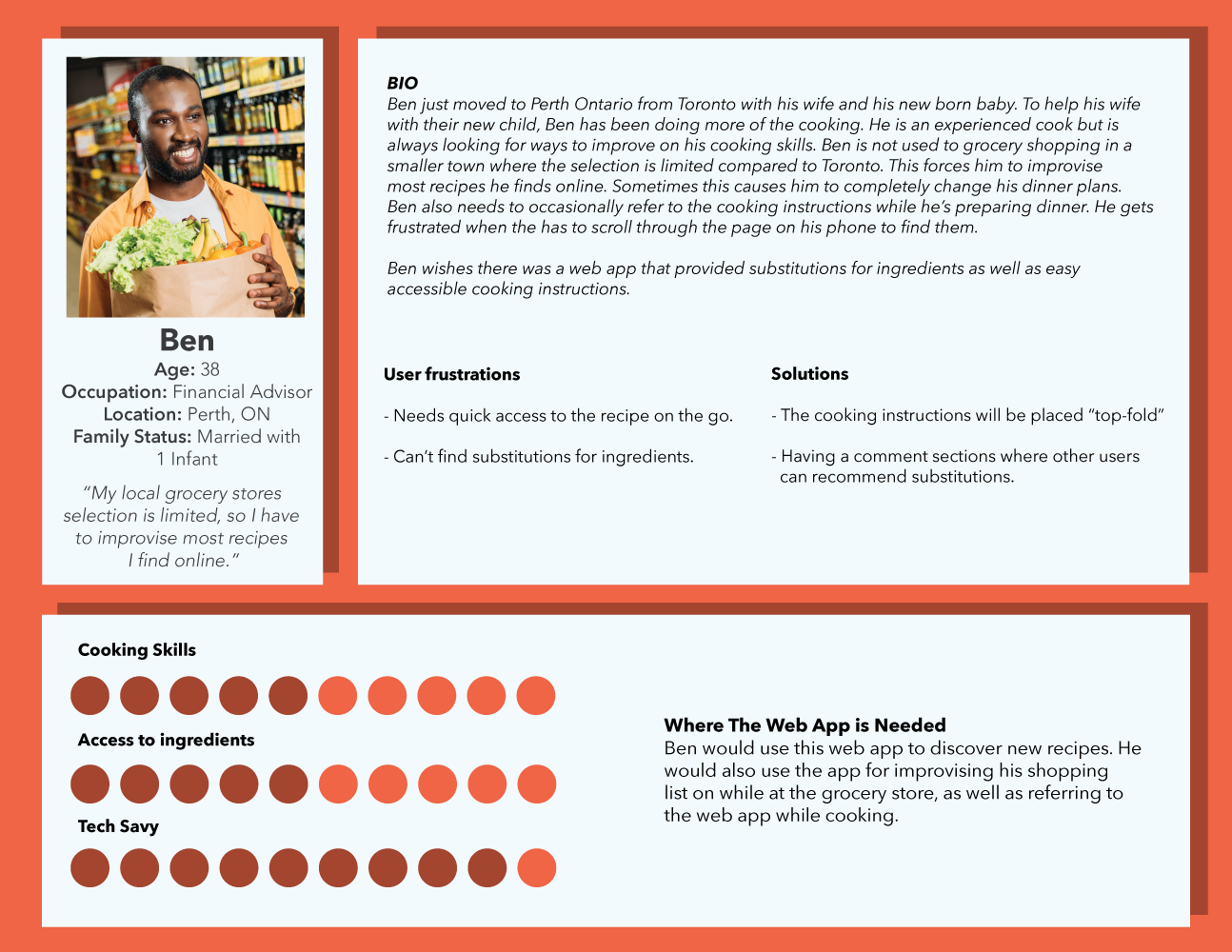
This project explores the design of a responsive recipe web app focused on usability during real cooking moments. Through user interviews and usability testing, I identified a common frustration with existing recipe websites: excessive back-story content pushes the most important information, ingredients, and steps out of immediate view.
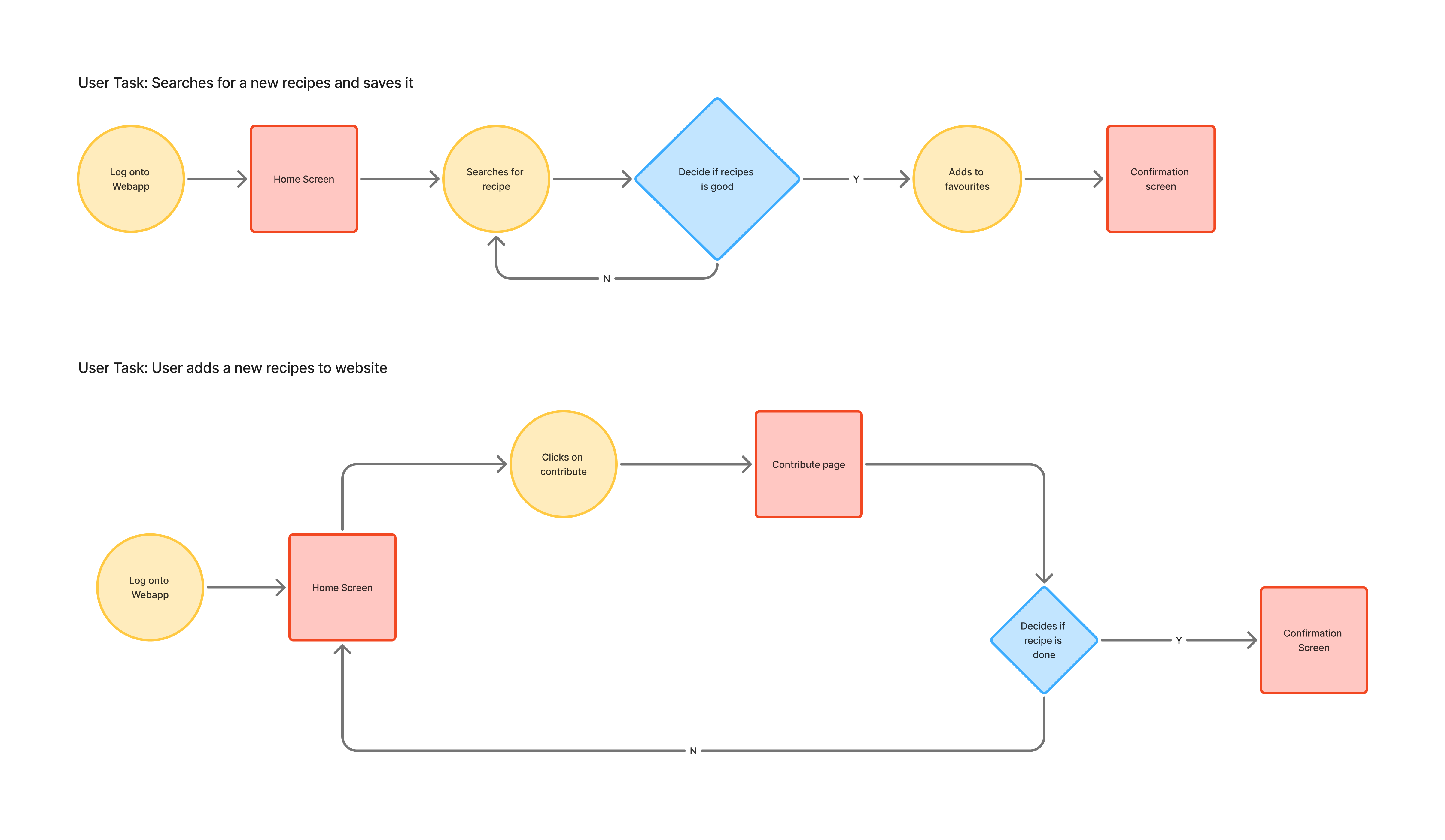
The goal of this project was to design a clean, responsive web app that prioritizes clarity, speed, and ease of use while shopping for ingredients and cooking.
Problem Statement
People who want to learn and cook new recipes often feel frustrated by long recipe back-stories placed at the top of recipe pages. This content makes it harder to quickly find ingredients and step-by-step instructions, especially when users are actively cooking or shopping.

As a result, users experience

  • Slower access to key information
  • Increased scrolling and cognitive load
  • Confusion during time-sensitive moments (e.g., cooking or grocery shopping)
Solution
Design a responsive recipe web app that places ingredients and method “above the fold.”

Key solution principles

  • Ingredients and steps are the primary focus on page load
  • Optional content (back-story, tips, comments) is secondary and collapsible
  • Clear, step-by-step cooking instructions
  • Easy access to ingredient definitions and substitutions

Understanding the Users

Key User Groups

  • Primary Users – Everyday Home Cooks
  • Secondary Users – Ingredient-Constrained Cooks
  • Occasional Users – Exploratory Cooks

Research insights

  • Users do not value recipe back-stories as a deciding factor for clicking or saving recipes
  • Users expect ingredients and instructions to be immediately visible without scrolling
  • Some users rely heavily on the comment section for ingredient substitutions
  • Limited ingredient availability creates friction and decision fatigue
  • Cooking instructions are often unclear or overly verbose
  • Users want to understand what an ingredient is and how it can be substituted quickly

Empathy & Personas

Empathy Map Highlights

  • Users prioritize ingredients and step-by-step instructions over any narrative or back-story content.
  • Any unnecessary scrolling or hidden information frustrates users and interrupts the cooking flow.

These insights informed two personas

  • Users need quick, easy-to-access cooking instructions to follow recipes efficiently, especially when improvising or multitasking.
  • Ingredient substitutions and guidance are essential for users dealing with limited ingredient availability or adapting recipes.

User Flow

Wireframes: Defining Structure & Priorities

I kicked off the design with low-fidelity wireframes to clearly define the layout, emphasize key tasks, and establish a logical content hierarchy—keeping the focus on functionality rather than visuals.

Key decisions at this stage

High-Fidelity Prototype

The high-fidelity prototype translates the wireframes into a polished, interactive design, showcasing a clean layout, prioritized ingredients and steps, and intuitive navigation for a seamless cooking experience.

Design considerations:

  • Ingredients and steps prioritized above the fold for quick access while cooking or shopping.
  • Clear typography and spacing to enhance readability and scanning on all devices.
  • Intuitive navigation to make moving through the recipe seamless.
  • Easy-to-find save and preview features to match user expectations and improve task success.

What I’d Improve Next

  • Present more refined wireframes or prototypes during user testing to avoid legibility issues and make feedback more actionable.
  • Provide clearer instructions for usability tests so participants understand the process and expectations upfront.
  • Consider separate mobile and desktop testing to account for different user behaviors and contexts.
  • Expand features like ingredient substitutions and recipe previews to better meet user needs.

Outcome & Key Learnings

  • Prioritizing ingredients and step-by-step instructions improved usability and reduced frustration while cooking.
  • Users responded positively to the clean, focused layout and expressed interest in updates.
  • Clear placement of core actions (like saving a recipe) is critical for discoverability.
  • Conducting user interviews early provided actionable insights that shaped design decisions.
  • Clear communication during usability testing is essential to avoid confusion and wasted time.
  • Prototypes should be refined enough for testing to avoid legibility or comprehension issues.
  • Designing for real-world context (time pressure, limited ingredients) leads to more effective UX.