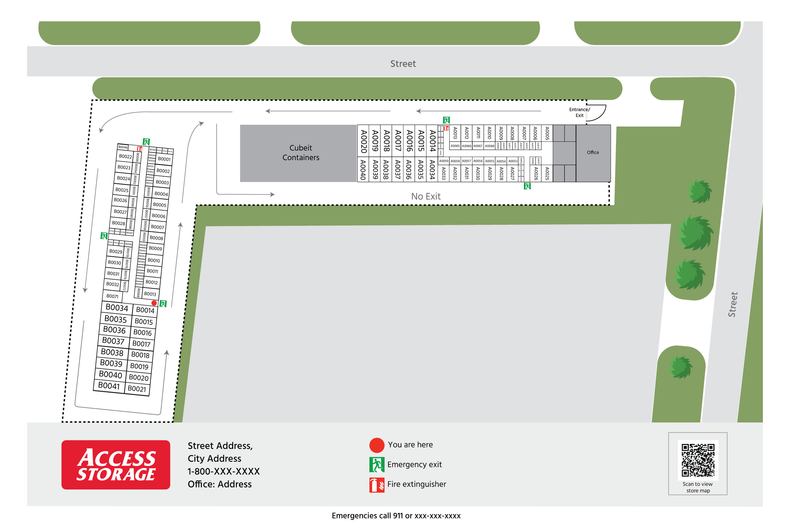
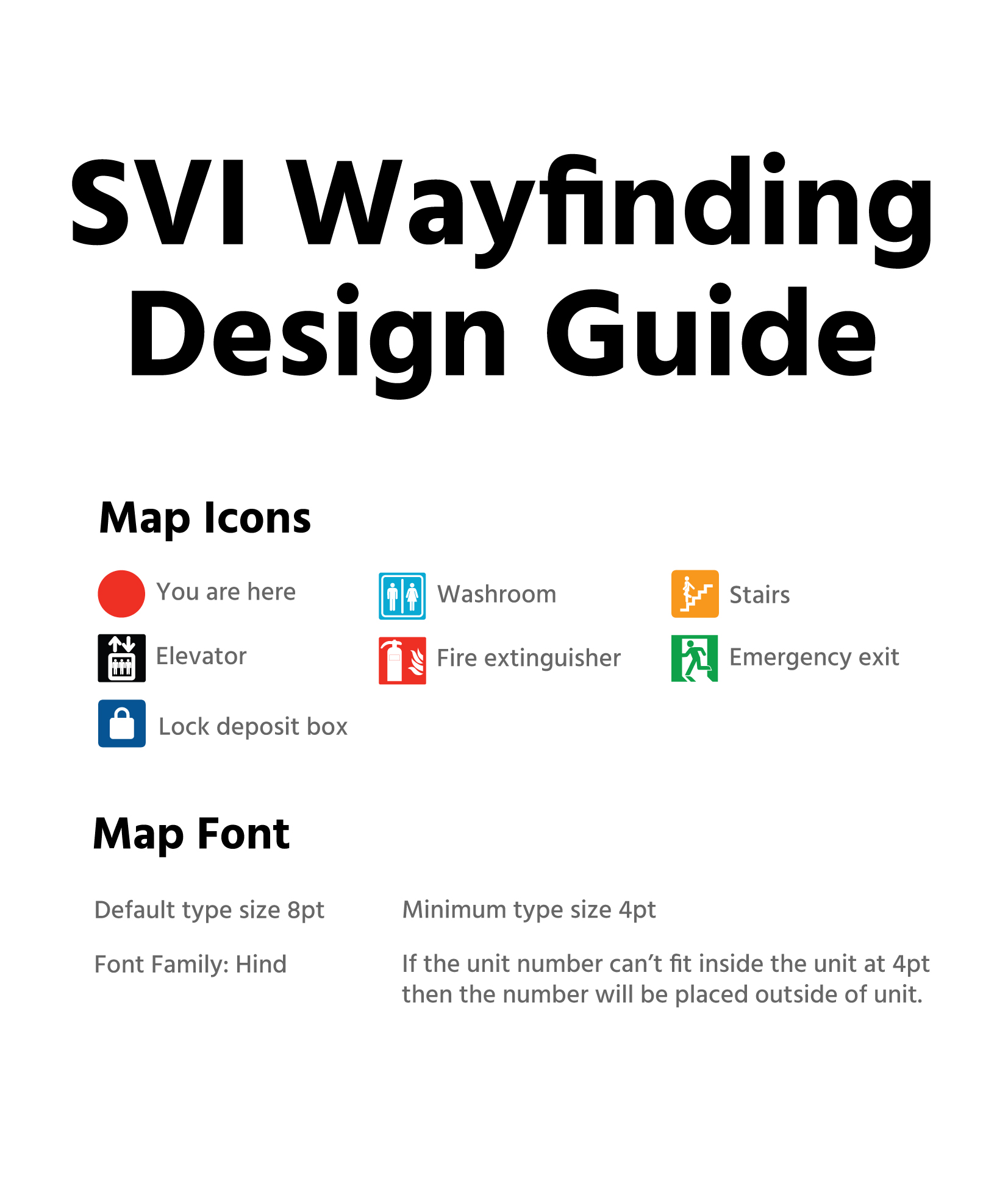
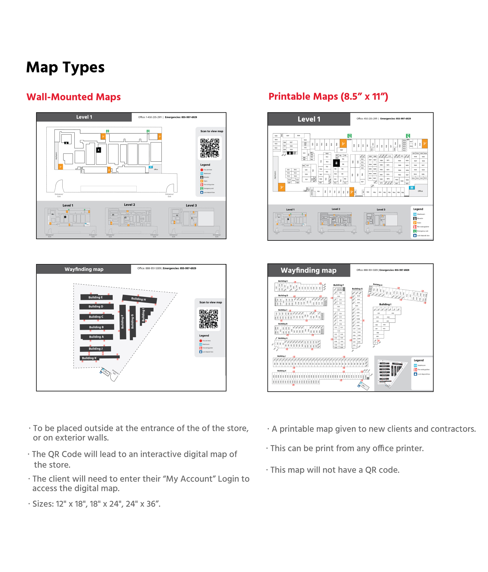
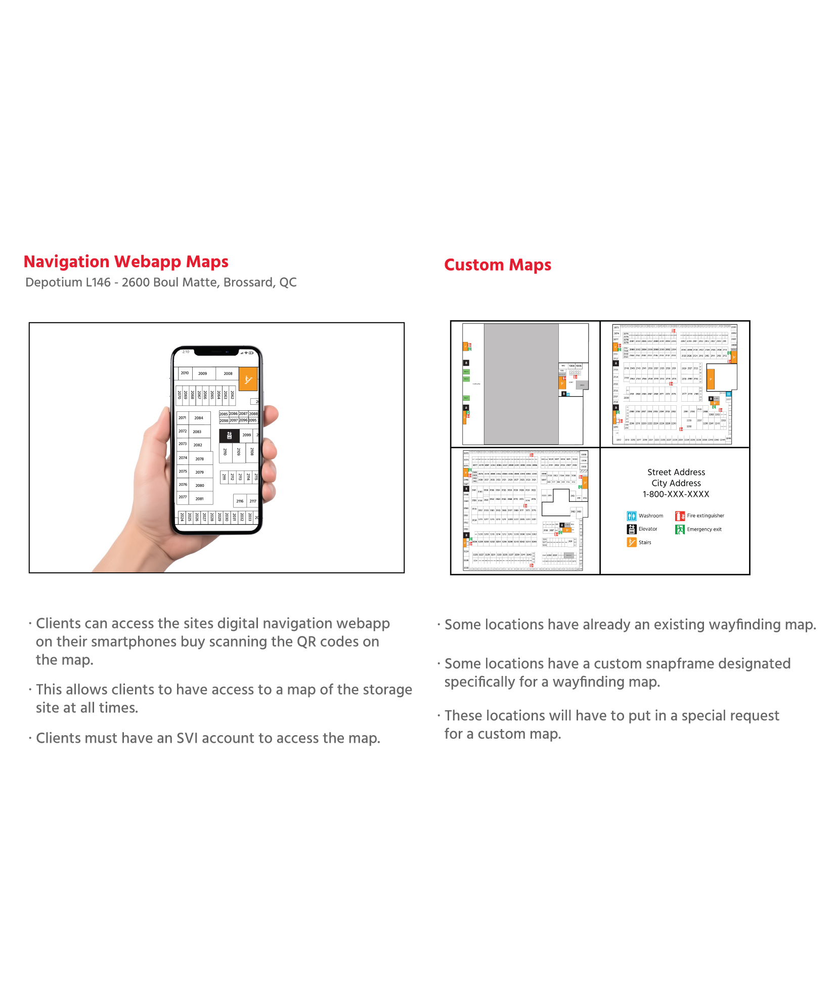
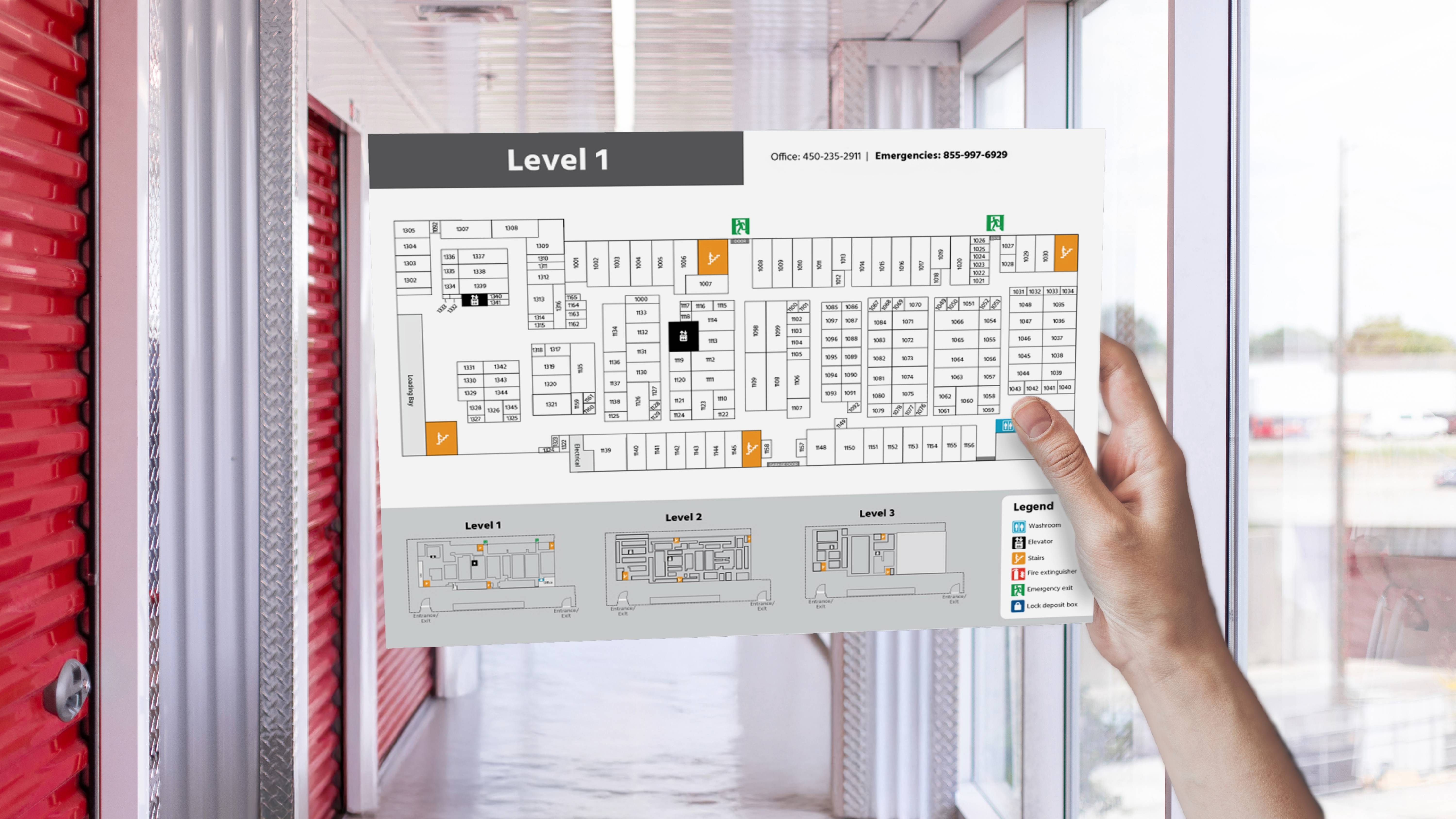
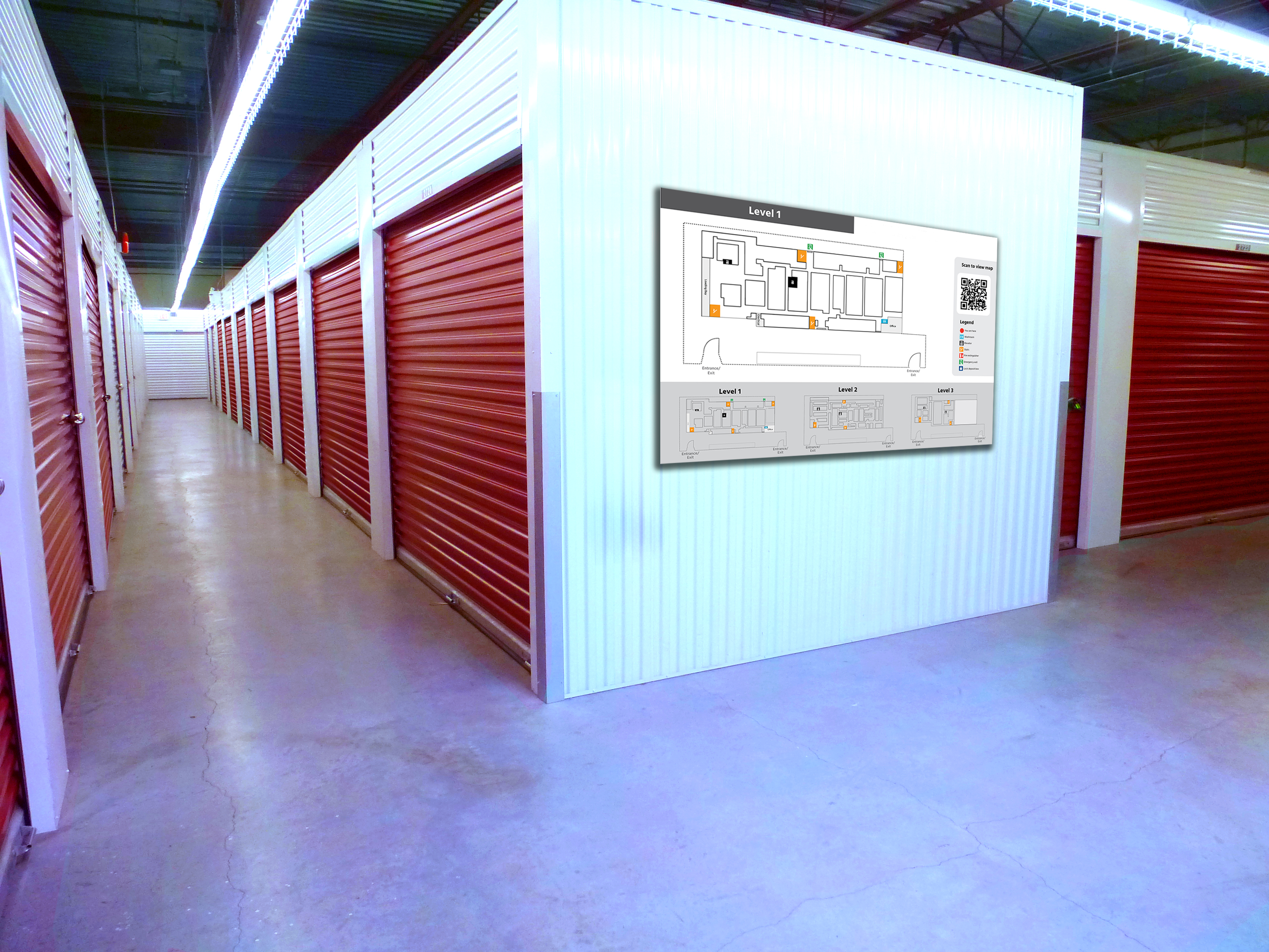
First Draft Map
The initial map design aimed to provide a comprehensive overview of the facility, but user feedback revealed that it was overwhelming and difficult to navigate. The maps included too many unnecessary elements such as excessive labels, decorative icons, and redundant information which distracted users from the primary task of locating their storage unit. Instead of helping, the cluttered layout contributed to confusion. This version highlighted the need for a more focused, user-centered approach to map design.